Blogs & News
Workspaces UX Refresh
It might have seemed quiet on the Workspaces front since we released our blog announcing support for large data tables back in May, however we have been busily working away on our new look and feel.
The project started at the beginning of last year when we carried out user experience workshops. We asked a wide group of new and long-standing users which bits of Workspaces they liked and which bits they’d like to see improved. Participants let us know that they liked the ability to collaborate with each other and heavily relied on the virtual machines (VMs). On the flip side, they found the file management system frustrating as well as the lack of native support for large data tables. Some workshop participants also told us they found the user experience of FAIR vastly different to Workspaces; something we agreed to work on.

We took all of the feedback and the Workspaces development teams identified how to solve each piece of feedback and prioritised them in terms of which were critical to fix, which items were commonly reported and which were easy to solve. One example of a piece of feedback which was commonly reported and which we decided to expedite was the ability to support large data tables; this was so important to our users and came up in just about every workshop we held so we knew it was vital to jump on it quickly. You’ll have seen from the blog linked above that this feature is now live and well used among our user community.
The UX project team have been working away in the background to overhaul the technical infrastructure which our Workspaces interface is built on. This has set us up to be able to quickly and efficiently build the new panels which our users will see. With this in place, we have begun the job of renewing each of the workspace panels.
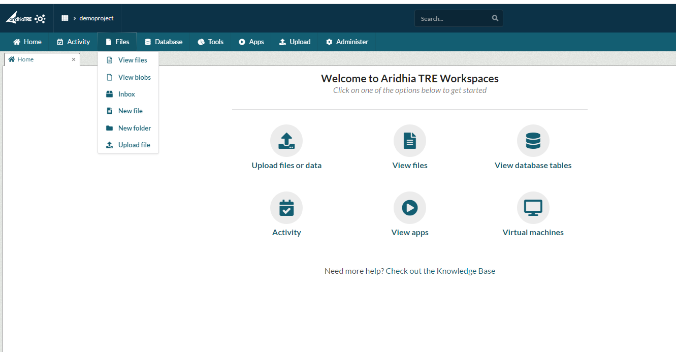
Starting with the Ribbon and Navigation, we have taken inspiration from FAIR and rejuvenated the Workspaces look and feel. All of the workspace panels can now be accessed using menus which drop down in the navigation bar; users can see the improved layout of panels and can easily switch between them.

Workspace administrators will also notice a new and improved screen for workspace management (which should already be familiar to Tenant Administrators!).
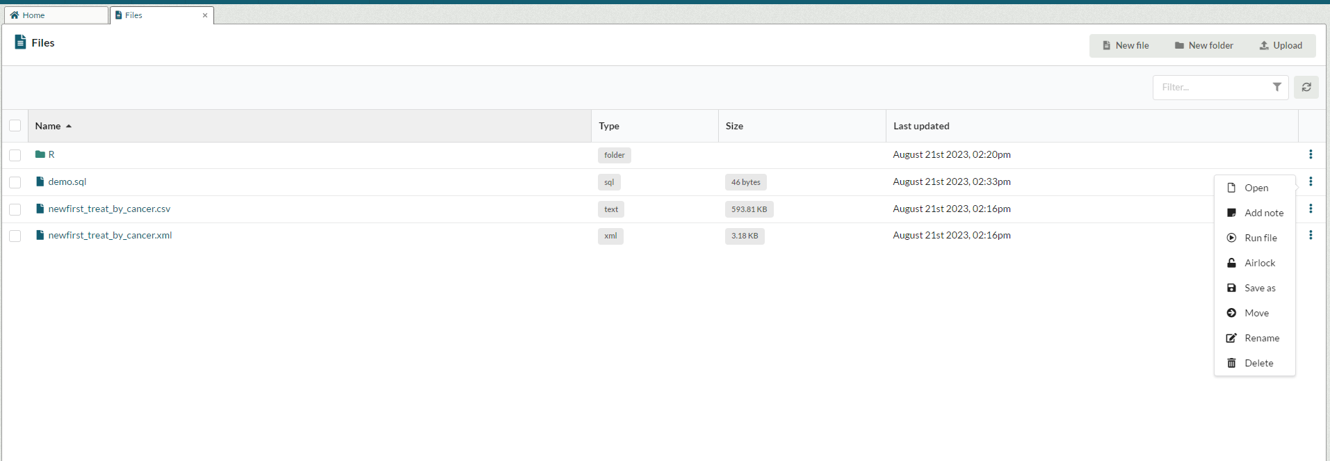
We have also finished work on the files list and are releasing this with the latest update of Workspaces. Workspace users can see the new design, easily search their workspace files and can carry out file actions using the menu in the table. New files and folders can be created using the buttons at the top of the table. Multi-file actions are available using the check boxes on the left-hand side of the table.

Aridhia are always keen to hear feedback from our community so we have added a feedback button to workspaces which allows our users to send us their thoughts, report bugs or add suggestions for improvements; the button can be found in the Ribbon right at the top of each workspace.
We will be rolling out all of our new features over the upcoming months so keep an eye out for these as well as future blog posts and updated Knowledge Base articles which should help you navigate and use the new features. In no particular order, we will be updating the database list and details pages, the database creation tab (CSV to data conversion), VM list, the apps list, the activity list and Audit. Please make use of the new feedback button or simply email us if you have any other feedback; we look forward to hearing from you!
September 6, 2023
Laura Shishodia
Laura joined Aridhia in March 2019 as the Product Owner for Workspaces, having previously worked in the Fintech sector. Laura’s role involves creating and maintaining the product backlog, defining the features of Workspaces and working with the development team to improve the product. Outside of work, she spends all of her spare time with her horse, Brutus.
